Free virtual hugs!
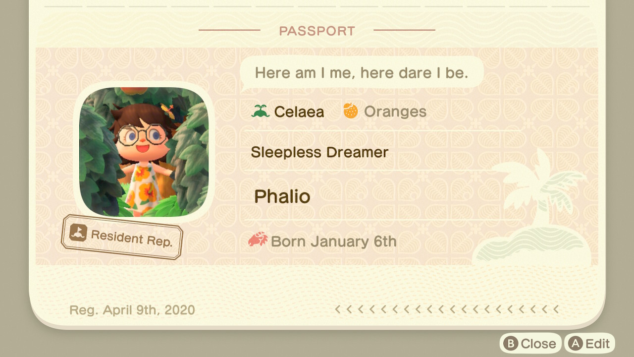
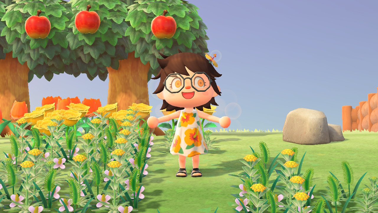
This is my beloved ACNH-me wearing one of my favourite outfits. It’s based on the passport photo I took in July 2021 that I really love (and that was taken before I changed my eye colour to yellow).


Of course I’m still busy with the PPKB and I still intend to do nothing else until I’m done. But I’ve really been wanting to draw ACNH stuff for a long time and I’ve had this one at the top of my to-draw list since last summer. Due to recent unexpected confidence level-ups, I had the idea last week to maybe finally draw this as I’ve been itching to and to use it with a modified background for the last day of June. This gave me an excuse to finally draw what I’ve been wanting to draw for so long and to get a much needed break from the PPKB. So I dusted off (very much literally) my drawing tablet and started drawing. Of course expectedly unexpected things happened that made me start a lot later than I had intended, so Pride Month is already over and all of those queer folk have gone back to Buckland, I mean to the North Pole where fictional holiday beings dwell until their annual event season commences once more.
I believe this drawing is the first thing I can think of that I drew only because I really wanted to draw it and not for some other reason like because I need something for an 8-bit fideo. I really enjoyed making it after overcoming the “initial brush-stroke doubts” and I very much love the result, looking at it makes me really happy, and I hope maybe also you too perhaps. I feel like this piece of art depicts a very important part of me that I’ve been unaware of, ashamed of and not living out. The warm, happy, cute and cuddly part. But happiness and kindness are nothing to be ashamed of. The world may be dark and full of terrors that are so unimaginably horrible that even hearing about glimpses of them nearly breaks my fragile soul. But it doesn’t have to be this way, the world can be a wonderful place. No, the world is a wonderful place. Every bit of love and creativity, no matter how small, makes it a better place and makes life worth living.
Back to the actual drawing. You might or might not have noticed that it’s missing an extremely vital feature: My beloved glasses, very cute and of very practical use at the same time. That is of course because I once again had issues drawing glasses on a face with a low amount of pixels. I tried quite a few different versions but they all looked bad or at least very cluttered. They didn’t look the way I like them because the thick pixels make the rims look way too thick for my taste and their existence in general at this resolution clashes with most of the eye detail and just makes it look like a big bunch of pixels mashed together. Only without the glasses I can clearly and easily recognise the eyes and eyelashes. I really should step out of my comfort zone and try doubling the resolution for works containing eye-glasses. This was my “best“ attempt that just does not at all look like what I want it to be:
While I drew it purely because I wanted to, I also want to use it as a profile picture, especially after it turned out so well. Which of course once again led me to measure pfp sizes on all kinds of sites and sub-pages, to once again fall into dispair as everything uses different sizes. These are the ones I wrote down (in pixels×pixels):
- 80 yt channel
- 64 twitch stream
- 58 misskey
- 48 yt fideo
- 48 mastodon
- 48 twitter
- 40 discord
- 40 yt comment
- 36 tweetdeck
- 36 peertube comment
- 35 peertube fideo
- 34 peertube user
- 32 yt subs
- 30 element
- 30 twitch follow sidebar
- 30 steam friends small
- 16 browser icon
The size is important because it’s pixel art, especially at small sizes it has to not be scaled or it will look blurry. I want it to be displayed pixel-perfectly. Previously I used 20×20 because it fits Discord which is where I myself saw my pfp the most at the time. This time I decided to use 24×24 since that fits YT fideos, Mastodon and Twitter, which are the sites I most commonly use and where others will see my pfp most often. And it’s half-way between 16 and 32 and a multiple of 8, an acceptable and reasonable size.
As I mentioned earlier, I wanted to get it ready for the last day of June. That is because for some reason my thinking has recently changed from “I’m not worthy enough call myself any of this even though I think about it a lot” to “I believe the meanings of some of these terms align with who I am“. At least quite surely non-binary and possibly also trans-something. I think. Splunge. ACNH was actually a big factor in yet another chapter of my self-discovery since it released, especially during its first year. This is how boring and bad my ACNH character started out before I dared to fully experiment with my (virtual) appearance (I of course still have that very special white+blue (purple!!!) pansy that Amarizo gifted me):

More on all of this in 10, 20 years when my website exists and I can finally make as many infinitely long posts as I want without having to make yet another temporary page that I’ll have to rework once I make the proper site. Anyway, at least for one day I wanted to make an NB flag background, this time with beautiful and fitting hand-picked colours instead of the boring rainbow ones I had eyedropped from Wikipedia (although the default NB colours are already really good, unlike the rainbow colours I used to use). Even the amount of stripes now perfectly fits the amount of pixels. Although unfortunately it doesn’t look entirely even, since the gahps in the hair are not of the same size but still cover the borders between the stripes, making it look like the bottom stripe is bigger than the others. But other than that it’s looking pretty good. I believe I’ll still use it for a day, or night.
Back to the last phase of The Neverending PPKB Story.
Edit: I just attempted to change my pfp on Mastodon and the pfp being round cuts off almost the entirety of the hibiscus and it also looks different with the top right end of the hair not being visible and less of the hugging arms being visible. I completely forgot about most things having round pfps. I guess I could try a 28×28 cutout instead, but changing the pixel dimensions would mess up the scaling on YT, Mastodon and Twitter and would in fact not be pixel-perfect anywhere. Why do pfps have to be round. Round things may look nicer compared to hard corners but I would really prefer square pfps, not every pfp works well with removed corners.
Edit edit: …I mean PPS: 28×28 looks blurrier but a lot better, I think I’ll use that. There go my carefully crafted pixel plans. I should go to bed, it’s already 2:45. What is sleep.