The other day Amarizo asked me what this new graph on the YT fideo progress bar is. It’s not the volume as he assumed. It’s not quite how frequently a part is watched just like creators can see in their analytics either, as I assumed.
“The graph above the progress bar lets you see which parts of a video are most frequently re-watched.” https://support.google.com/youtube/answer/7174115?hl=en
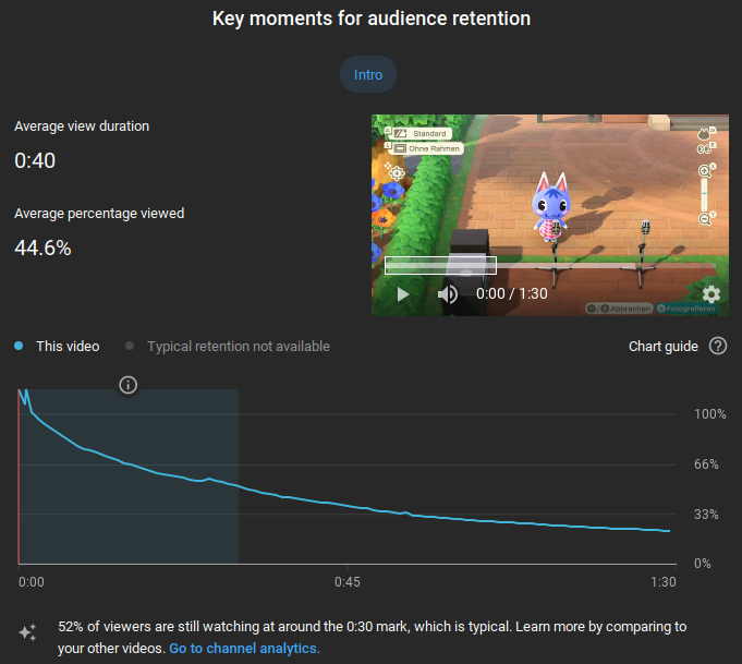
It’s how many times the same people during the same view repeat something, as far as I understand now. Because the creator analytics for how frequently parts are watched look very different, as we tested with his/our Rosie fideo.
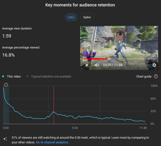
It actually took me a bit to find this graph in the analytics as I haven’t used the analytics at all for so long. They weren’t healthy for me. Seeing that for 12-minute fideos that take 200 hours to make, 50% of viewers stop watching during the first 30 seconds, only 14% watch most of it and only 8% watch until the outro starts is certainly not very motivating. Everyone is different, but if you feel like seeing the analytics is making you unhappy or you check them too often, I recommend setting a rule for yourself not to open them anymore. I don’t see any benefit in knowing your analytics if you create to satisfy your own creative desires. And comments, actual people instead of cold, lifeless, meaningless numbers, should be enough to give you a feeling for how others view your stuff. I made a browser bookmark directly to the Creator Studio’s comments tab so that I wouldn’t have to go past the dashboard analytics first that rub into my face exactly by what percentage I performed worse now compared to the last millisecond. Your last fideo received less views than usual, by the way!

Anyway, I personally don’t really see the point in viewers having this graph displayed so prominently. They removed the ability for viewers to see dislikes, which I have no final opinion about, but they added this? Are people supposed to skip to only watch frequently re-watched parts? I don’t understand. And I would prefer not to see the graph. Which I guess I could if I were to use mpv and FreeTube more on my desktop PC as well.

